
In the 1920’s, German psychologists Max Wertheimer, Kurt Koffka, and Wolfgang Kohler developed the Gestalt principles when they were studying human perception and how the human brain makes order out of chaos. Wertheimer, Koffka and Kohler observed that we do not identify patterns, group elements, and simplify intricate images randomly. Humans organize their perceptions under certain principles. The psychologists used the German word “gestalt” which means “unified whole'' to name these principles.
The Gestalt principles are rules that illustrate how humans order their perception of the world. The human brain organizes and simplifies complex images that consist of many components into one whole system. Instead of seeing distinct, separate components, humans will look for patterns and structure and make an image. This is why we sometimes can see faces in potato chips or why we think clouds look like certain shapes. This is why designers such as UX/UI designers use the Gestalt principles to make the experience they are designing intuitive and aesthetically pleasing for the user.
The Gestalt Principles Explained
If you have found your way to The Guac, chances are you are interested in pursuing a career in UX/UI or at least the tech industry, in which case it is a good idea to have an understanding of the Gestalt principles. No worries, The Guac’s got you covered! We will be discussing 10 Gestalt principles: connectedness, common region, figure and ground, symmetry, focal point, similarity, closure, continuity, proximity, and common fate. We break down each principle and show you examples, so you can walk away with a clear understanding of how you can apply the Gestalt principles to your designs. Grab your chips and let’s dig in!
1. Connectedness
Source: Best Web Design
The connectedness principle states that humans group elements when they are connected to each other. So elements that are connected visually, are seen as more related than elements that are not connected. Rather than observing individual and unrelated things, connectedness causes humans to see things in groups or chunks.
You can use the principle of connectedness in your designs. Elements that are physically connected to each other will tell your users that these elements work together.
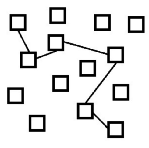
In the above image, there are 14 squares that are randomly placed. However you can see how the 6 squares connected by a line seem more related to one another than the squares not connected by a line.
2. Common Region
Source: Alex Infante
The principle of common region is similar to connectedness, but rather than focusing on elements that are physically connected, this principle states that elements will be perceived as a group if they are enclosed in the same region.
You can use the principle of common ground in your designs. Elements within a clearly defined border will signal to your users that these elements work as a group.
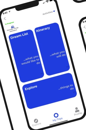
Take a look at the example above from the portfolio of Avocademy alumn Alex Infante. Here you can clearly see that all the info enclosed within the Dream Life section is related, as is the case with the Itinerary and Explore sections.
3. Figure and Ground
Source: Toptal
The principle of figure and ground demonstrates how humans identify if elements are in the foreground and are seen as figures (elements of focus) or in the background and are seen as ground (elements at rest). Humans do this instinctively. We also understand that the background is less important than the foreground.
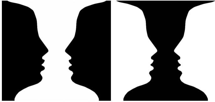
In this famous illusion above created by Danish psychologist Edgar Rubin, you might see two faces whereas your friend sees a vase. In this case, there are two images within the foreground and the background which leads to two interpretations of the same image: some people see the faces first while some see the vase first. The use of the figure and ground principle can lead to interesting design creations that play with user perception.
Of course, you do not always want to play with your user’s perception. In UX/UI design you often want to direct it. You can use the figure and ground principle in your designs to direct the focus of the user mainly by contrasting elements. For example, you can use light text on a dark background or vice versa. The blog you are reading right now is using dark text on a lighter background. You instinctively distinguished that the words are the focus of the page, not the background.
4. Symmetry
Source: Best Web Design
The principle of symmetry reflects the idea that humans are more comfortable with symmetric elements. Symmetry gives the impression of organization while asymmetry triggers a sense of unbalance.
Using the principle of symmetry in your designs can help create a sense of ease for your users. They will not feel like something is out of place or off with the app or website they are interacting with.
Of course you do not have to use complete symmetry in your designs. That would be very difficult and honestly a little bit boring. It is best to use symmetry and asymmetry in harmony. An asymmetric element will stand out in a website or app that is primarily symmetric. You can help direct your user’s focus by playing with symmetry. The key is to not organize your elements randomly, but to find a balance between symmetry and asymmetry, so you can keep your users engaged and at ease with your design so they can accomplish their tasks.
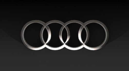
The Audi logo is a great example of symmetry. In the image above you can see four interlocking circles. This is a simple design as opposed to using more complex shapes.
5. Focal Point
Source: Codey Smith
The focal point principle demonstrates that the attention of the viewer is first captured by whatever element stands out visually. Many of the other principles can be used to help create this focal point. As mentioned previously, using an asymmetric element in a symmetric system can draw the user’s attention to that asymmetric element because it stands out compared to the rest of the system.
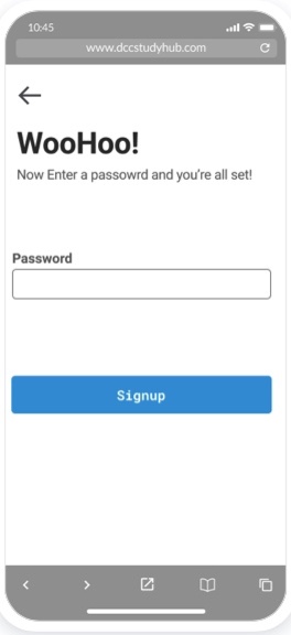
Figure and ground can be used to create a focal point as well. If you have a light background and a bright blue button in an app, the user will be instinctively drawn to that button. Take a look at the above image. Avocademy alum, Codey Smith, used focal point in his design. You can see that your eye is immediately drawn to the blue sign-up button.
The idea of the focal point is that it is what you want the user to see first, and from there, the user’s attention can wander to other aspects of the page. Focal points are really useful when it comes to calls to actions. You want to direct your users to take action instinctively by drawing their attention to that element.
6. Similarity
Source: Andy Rutledge
The principle of similarity states that people tend to group elements that look like each other or follow a similar pattern. We tend to group things by color or shape, for example.
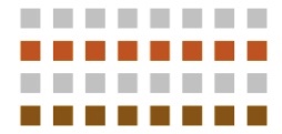
In the image above, instead of seeing 32 separate squares, your mind categorizes the blocks horizontally into rows.
You can use the principle of similarity to help your users navigate your designs more intuitively. Elements that have a similar function or meaning should look similar because users will perceive an element's function and know that an element that looks similar will also have a similar function. You could confuse your users if some of your elements look similar but have different meanings or functions.
7. Closure

Source: User Testing
The principle of closure reflects the idea that humans like to see the whole picture even if there isn’t one there. The human brain will fill in any gaps or connect the dots to complete images or shapes that are implied.
Using the principle of closure allows you to decrease the amount of elements you use while still ensuring that the user will understand what you are trying to show them.
The NBC logo is a great example of the closure principle. You can see that the image is a peacock, even though the image is not completely defined.
8. Continuity
Source: User Testing
The continuity principle demonstrates that individual elements that are aligned with each other will appear more related than elements that are randomly placed. Implied lines can guide users and the human brain will create a path along aligned elements.
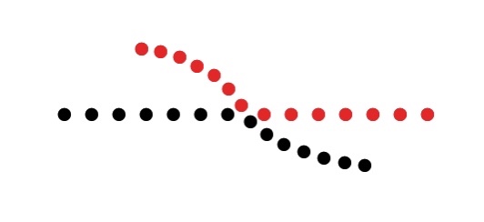
In the above image, your mind sees the dots on the curved line as more related even though they are different colors. Your mind naturally follows the flow of the curved line, making continuity more effective than color similarity in this example.
The continuity principle can help to guide your users across a page as they follow the line of continuity to important elements. The users’ eyes will automatically follow the path you laid out for them. If the continuity is disrupted, this signals to the user that they have reached a new section of the interface. They will not have to think about where to go next because you have guided them through your design.
9. Proximity
Source: User Testing
The principle of proximity represents the tendency for people to group elements that are near each other. This principle is even stronger than the principle of similarity. Even if elements are the same color, but in two different groups, you are more likely to view them as separate.
You can use the proximity principle in your designs to bring together elements that are associated with each other. Make sure captions are close to the pictures they are describing. You can use white space or a specified background to separate items and demonstrate that they are unrelated.
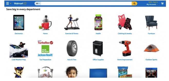
Walmart uses proximity to show that each image goes with a certain product name.
10. Common Fate
Source: Andy Rutledge
The principle of common fate states that people will group together elements that are moving or pointing in the same direction. For example, a school of fish swimming in the same direction are sharing a collective common fate. They are seen as one entity. But if a fish broke away from the school, they would no longer be seen as part of that group.
You can use the principle of common fate in your designs to guide users and fulfill their expectations. Now that animations are becoming more prominent, it is important that elements that belong together move with the same speed and direction. Elements do not necessarily have to be moving to use this principle but they should give the impression of movement
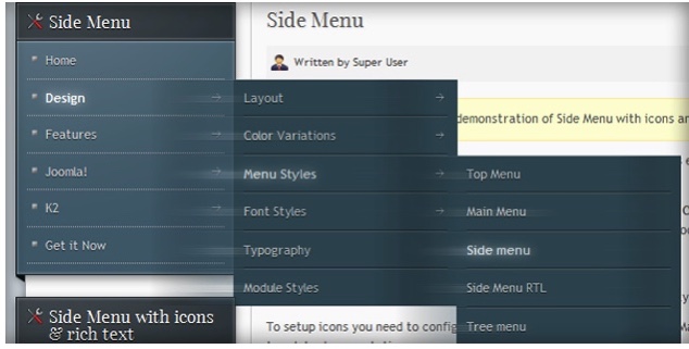
In the above image, you can see that this principle is used in the slide-out menu. The sub-menus all fall into place in a way that implies movement.
Why are Gestalt principles important to designers?
In order for UX design to work, a designer needs to have a firm understanding of the psychology of human perception. You need to understand how the viewer will perceive your work, and using the Gestalt principles will help you do this. Now that you understand these principles, incorporating them into your designs will be a piece of cake. You can create a design that offers your viewer a smoother, more natural experience that at the same time guides the user to the desired action.
Ready to learn more about UX design? Schedule a free mentoring session with a UX designer today!

Explore the Latest in Design Trends and Job Tips
Join The FREE Challenge
Enter your details below to join the challenge.